The things that you learn as a freelance UX/UI designer – and I’m not just talking user centred design or experience mapping! I am now fully conversant (almost!) in all things ‘cesarean section’ after working with Pinkkies.
The Challenge
Pinkkies wanted to deliver a new product to a niche market via an informational website, with a view to also attracting potential wholesale clients. To this end the wanted to convey a strong brand message and also implement a simple process for retail sales. The main objectives were:
- Create an online approach that responds to user needs so more people are getting the help and advice they need
- Gain a full understanding of the target market and the needs and requirements of Pinkkies customers
- Provide recommendations for the Pinkkies site that can be easily implemented to maximise conversions
- Ensure that the customer experience is consistent with customers’ needs
- Assess the feasibility of ideas for desirable website features
- Determine the overall ease of use, effectiveness and proposition of their new website
Rationale behind the design
This was a personal project I undertook alone and I was keen to adhere to a simple, aesthetic and minimalist design given the fact that aesthetic designs are perceived as easier to use than less-aesthetic designs. Aesthetic design is more readily accepted and used over time and helps to foster positive relationships with users. It evokes feelings of affection, loyalty and patience and is important, in this case, as it can have a calming effect in a time of stress (pregnancy can undoubtedly be a stressful time) and enhance the overall user experience.
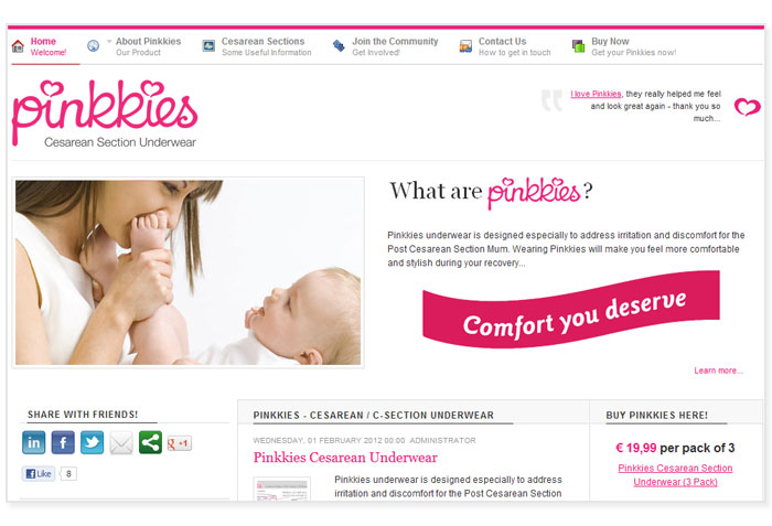
As a new site, I felt it was important to make users immediately aware of what that message is on encountering the website homepage. That it is dedicated to women is clearly evident, as it the fact that it is selling a product and all they key information is above the fold and located in the primary optical area.
These key areas (Header / Share / About / Buy) are structured as the header and main items (left to right) in a 3 column, main body, layout. These are points of prospect, providing strong orientation cues and navigational options. The header acts as a ‘progressive lure’ on the site, a gentle introduction, designed to be easy on the eye with lots of whitespace and warm imagery. If successful, the design will serve to get users to incrementally approach, enter and move through the sites primary ‘entry point’ i.e. the homepage.
Consistency is an important consideration in the design of the any website. Aesthetic and functional consistency were promoted here, with similar style and appearance used throughout. This serves to enhance (brand) recognition and improves usability and learning, especially important for users who return to the site regularly to get involved in the community.
Usability was further enhanced by using expository advance organisers in information presentation, providing users who have little or no knowledge about the product and/or the procedure with a brief description in advance of further exploration. There was debate as to how best to structure the information here, but user research lead us to conclude that most users would be new, first-time mums, so this approach was adopted in favour of comparative advance organisation which would have suited ‘experienced’ mums. Information was ‘chunked’ where appropriate (where remembering facts and figures was concerned) to accommodate short-term memory and improve overall site readability.


