Background:
A recent project I was involved in at the BMJ sought to improve the user experience of one of its clinical decision support apps with specific regard to the search journey and the processing and displaying of its search results.
The Challenge:
The business – understandably – wanted to highlight the depth of research and knowledge (there are complex algorithms at play!) the product showcases, but this impacted negatively on app performance. A simple search input could return hundreds of results and this had an obvious effect on the product’s overall user experience. (App store reviews attest to user frustration).
UX Design & Research:
I facilitated an ideation session with two members of the business to address this issue. We began by sketching out the existing search user journey on a whiteboard and we ideated alternatives from there. Applying knowledge of the UX and usability of online search and search results pages – and the concept of information scent (thanks Jacob!) – we arrived at what we agreed might be a very useful – and usable – solution.
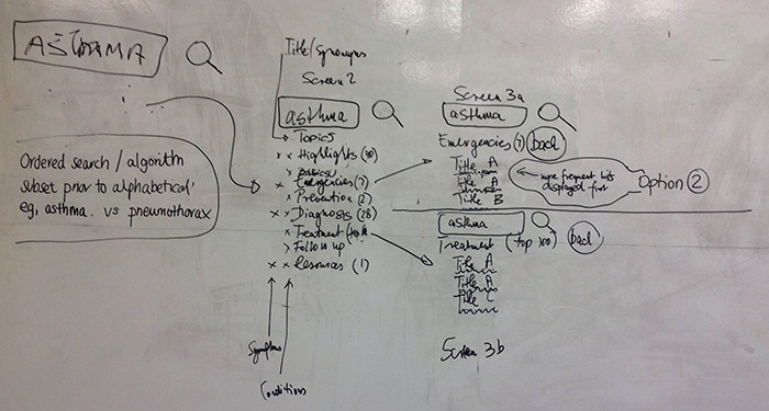
A user will continue their search journey only as long as they feel that they are closing in on relevant results (i.e. they continue to narrow / reduce the size of the the information space). If a user feels that this is not happening, they will quickly become frustrated and will terminate the search effort.
Like any other UI interaction, there is an interaction cost associated with searching. Again, a user must feel that for their efforts (interactions) they are getting an adequate return (or experience). If not, the interaction cost is too high. Think of it as expectation mapping. If my expectations are met with every interaction, I’m a happy user (if not … well, the App Reviews say it all!). However, if my expectations are exceeded, then I’ll feel really good about the product I’m using – and perhaps become an advocate by telling my mates or sharing through social media!
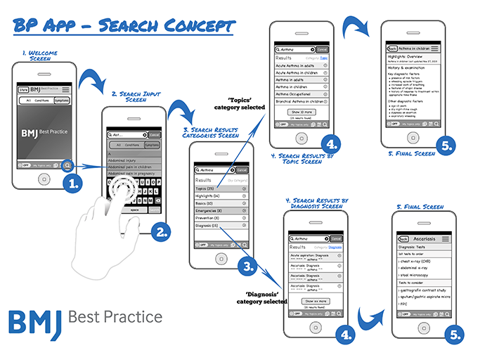
Rather than making our users do all the work in a) waiting for the search results to actually load (a significant interaction cost) and b) trawling through the sea of results to find what they were looking for (another significant cost), I suggested that we narrow the search space incrementally by adding 2 more interactions to the process.
Some thoughts:
Some may find it counterintuitive to good UX to add interactions when we generally try to make tasks more efficient, but this would do just that. By choosing which category and optionally another sub-category they could search in – and highlighting the reduced number of search results at each step (narrowing the information space) – we present the user (and the overworked app itself!) with a much more manageable number of results on the search results page.
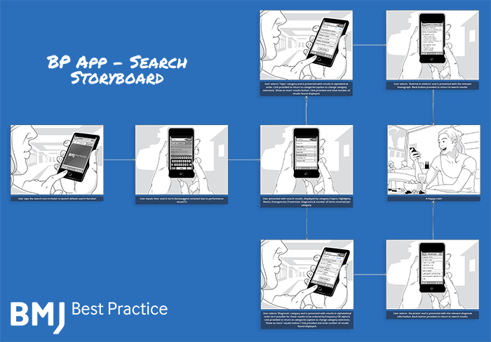
This would also serve to put the user in control of the entire search journey. By highlighting the shrinking information space (showing the number of results which follow) the users expectations are set – and thus always met. This is a significant UX win.
A rapid additional 2 sequential taps versus a interminable (often undelivered) wait for the app to fetch hundreds of results? I think the interaction cost of these taps would be very low relative to the expected improvements in the overall user experience.


