
Will the removal of informational elements negatively impact the search results page of a clinical decision support tool?
UX & UI Portfolio & Blog
Will the removal of informational elements negatively impact the search results page of a clinical decision support tool?

Building a global healthcare research tool: Is Lean UX’s build-measure-learn paradigm the right choice to get us there?

Research shows that usage metrics take a dive as interaction costs increase. Keeping this ‘cost / payback paradigm’ in mind when designing your UI is critically important…

Users usually recognise that a magnifying-glass icon indicates a search tool, even when it has no label. Unfortunately, showing only the icon makes search more difficult to find.

Is adding extra interactions a UX anti-pattern? Can additional interaction cost ever be a good idea? Is it counterintuitive to good UX to add interactions when we generally try to make tasks more efficient?
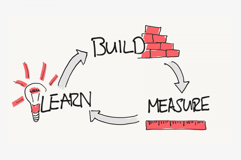
The beauty of using Lean UX principles and A/B testing is that it allows us to make decisions that are based on real behavioural data rather than presumed knowledge about our users.


