Investoo have established themselves as a trustworthy and respected provider of news, education and market analysis for the every-day investor – and with a constant flow of new investment, acquisitions, and product launches, they’re not slowing down any time soon. While I can’t offer up too much about the work I was involved in at Investoo (it’s still in stealth), I can say that working with the fantastic product team there remains one of my career highlights.
Some background
Investoo hypothesised that an opportunity existed to externalise an internal data-enriched, compliance-centric, affiliate marketing tool. The product team – I was UX lead – were tasked with bringing this product to MVP stage to test it’s viability and pitch it to investors for funding.
If the original, internal product was a great business process tool, the new one ultimately needed to be a truly scalable double-sided platform. For our MVP, this meant re-imaging the UX and UI, redesigning dashboard flows and creating a brand new marketing site for onboarding and payment journeys.
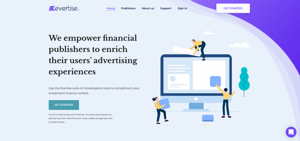
// Marketing site branding and UI hi-fi design //
It also meant designing these in a way that would allow new and novice users engage seamlessly with what was a complex piece of financial technology. On top of this, we had to insure business continuity (the product was still crucial for day-to-day operations), all testing goals and challenging constraints on the road to our MVP.
My Role
I led the UX research and UX/UI design of the dashboard and the marketing site, concentrating most attention on the MVP onboarding and payment flows and dashboard usability - the places where financial publishers sign up, log in and manage their lead-generation and affiliate marketing needs.
I also played a role in the product / UX strategy and management: benchmarking our current user experience; creating a detailed vision for the user experience we were trying to create; modelling the commercial outcomes resulting from realising that vision (as well as the cost of doing it); working with a prioritised roadmap (owned by our Product Manager) of what needed to happen to get us from where we are today to where we want to be; regular measurements to monitor progress and success, and; a plan for developing the capabilities and culture of the organisation to achieve all of this!!
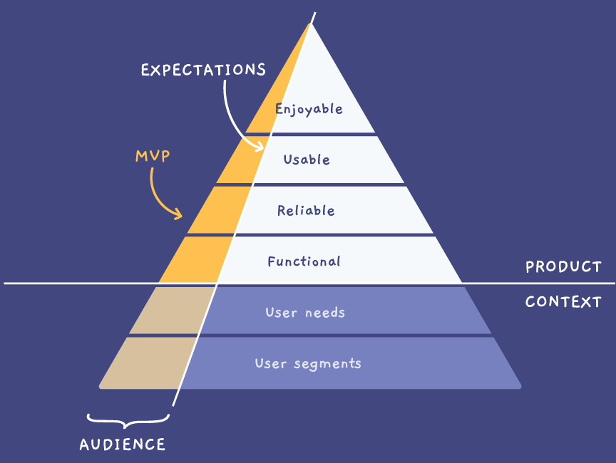
// Our MVP goal was focussed on product usability (image source) //
The Challenge: Off to see the Wizard …
The ultimate goal was to build the smallest solution we could that delivers value to our customers – a new version of our dashboard that would enable large publishers to use the system without excluding the needs of smaller businesses.
It had to work for everyone from big media to small financial publishers. The challenge we set ourselves was to deliver a Wizard of Oz MVP which created the picture of a fully functional product while using a bit of manual labour to deliver the finished solution (manual onboarding, compliance checks and payment processing behind the scenes). We had 4 months to do so.
The Process: The Road Through the Forest…
Step 1: Identify / understand business and market needs
Before we built anything, we wanted to validate a need – an organisational and/or a customer need – for the product that addressed an existing gap in the market.
We conducted as much primary research as available to us (this was hard as access to our intended users was difficult during the discovery phase – not unusual for MVP development), but relied mostly on secondary research and on stakeholder and internal user interviews, given we had extensive domain knowledge internally.
We also set our success criteria around the business outcomes we wanted to achieve – OKRs (Objectives and Key Results) aligned with our key UX flows (onboarding and payments).
Step 2: Defining the offer
What value does our product offer to its users? How can it benefit them? Why would they adopt our product? These are important questions to keep in mind. We ran lightweight ideation and design workshops to unpick questions such as these. From here we put together some overarching design principles that we leant on when we met dead-ends or wicked design problems (there were a few!).
Step 3: High-level Design Principles
We made a collective decision that the process didn’t require a conceptual design phase. We had a live product, very close to what we wanted to offer externally, but obviously needed to be cognisant of building a scalable offering that also worked for novice and new user needs.
Instead we focussed on design principles and design aesthetics: branding (identity, image, positioning, personality, values and differentiation); tone of voice (principles and content structure, our UX writing), colour (and the psychology of colour – as we know, both relative and subjective, so we had to figure out how to control that subjectivity); typography (physique, personality, relationship, culture, reflection and self-image, all which would align with our brand) and imagery (Graphics? Illustrations? Photography? Contained or immersive?).
Meeting the wizard
So we did deliver a reasonably polished marketing site, and redesigned our internal tool to allow for externalisation and ease of use , but as with Wizard of Oz MVPs, we worked almost exclusively on the front-end, with backend business process handled manually for MVP delivery.
We focussed our intentions on improving our dashboard UI and UX and embedding dashboard UI best practices for the core MVP offering – the onboarding user journey through the marketing site and a high level dashboard experience – but only for the aggregated data – with no querying or other advanced features.
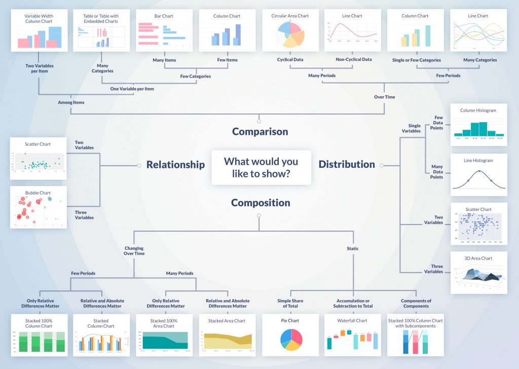
// Best practices for dashboard design and choice of data viz tools //
The Outcome: MVP Delivered
As mentioned, I can’t expand much on this project other than to say we delivered on our MVP, complete with stand-alone marketing site, in under 4 weeks.
Working on what was an internal business tool – and ensuring business continuity while redesigning the interface and improving the UX – was indeed a challenge! Prioritising a small number of key functionalities while focussing on one or two red-route journeys, meant we could add some hi-fi design and polished UI to (attempt to!) wow potential investors, while simultaneously handling the back office tasks manually behind the scenes to give an end-to-experience in true Wizard of Oz fashion.


