Picture the scenario. A user visits your website or app. The page loads and the information they’re seeking is right there – front and centre, visible and obvious. Congratulations! You have reached the zenith of usability. You have levied zero interaction cost on the user.
“The interaction cost is the sum of efforts – mental and physical – that the users must deploy in interacting with a site in order to reach their goals.”
As you might imagine this is a rare occurrence, as most sites offer a range of interactions users are loath to perform – clicking, browsing, reading, form-filling etc etc. In addition, the user must understand, remember, make decisions and weigh up the alternatives, which can amount to a significant cognitive and temporal effort. Jakob Nielsen describes interaction cost as “the sum of efforts – mental and physical – that the users must deploy in interacting with a site in order to reach their goals.”
Usable sites reduce the interaction cost necessary for task success. Good UI design acknowledges where an interaction cost exists and redresses the balance when this cost is considered high.
If you have to impose an excessive interaction cost on the user – for example endless form inputs or slow page load or time-to-interactive – you should pay it back ASAP or risk losing users through poor usability.
This ‘cost / payback’ paradigm is particularly important at the onboarding stage, where high interaction costs can stop users in their tracks.
A quick case study: The BMJ Best Practice ‘CME / CPD’ Onboarding Journey
Ok, so we wanted to get our users using our cool new feature. To use it, they have to register. This is onboarding, the goal of which is to get users to cheerily provide you with some personal information so they can access a feature you want them to access.
Simple, right?
Best Practice started offering users the ability to gain CME (Continuing Medical Education) credit for doing what they’ve always done – consume BP content. On the face of it, this is a free win for users. They should be happy and grateful that we are so generously providing them with this feature, right? Yes, but as ever, there’s a caveat.
For BP to track a user’s usage, they need to be registered and logged in as personal subscribers. Access is more commonly provided by a user’s institution, or by Athens or Shibboleth, third party identity and access management providers. Our own ‘personal user’ registration journey has always imposed a high interaction cost.
To make this task less onerous, existing technical constraints were bypassed, the registration form surfaced front and centre on the UI and the number inputs were cut. Standard fare. This, we hypothesised, would reduce the interaction cost previously levied via the ‘personal user’ onboarding journey.
To validate our hypothesis, we broke down the constituent components of the interaction cost of the journey (outlined below). In the interest of brevity, we’ll assume that our user has just hit the website. Here goes. Read aloud and sequentially!
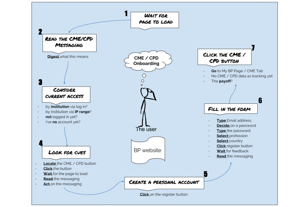
Interaction Cost of CME / CP Onboarding
What came to light was that the task doesn’t begin and end with filling out our much-maligned, and now now much-reduced, registration form. Other effects are at play here. Onboarding users for the new CME feature was not entirely painless, as we had originally thought, and the interaction costs levied by the micro-tasks involved not insignificant.
This was a very useful exercise – drilling down into the emotions and effort required from a user encourages empathetic design. Taking the time to conduct an audit of the real interaction costs imposed on the user is a very rewarding exercise.


