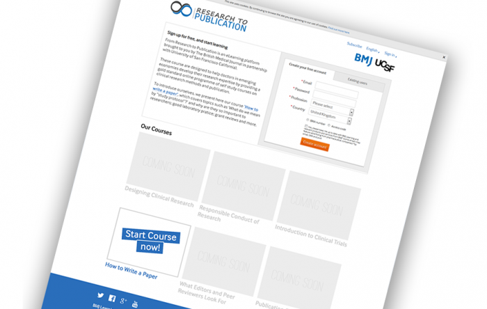
BMJ Learning made changes to its registration form that resulted in an immediate 3-fold increase in customer registrations – changes informed entirely by user feedback and evidence from user tracking.
In an attempt to integrate the ‘voice’ of the user into our workflow, I made the suggestion we incorporate Lean UX principles into our design and development process, and this project was the first one to see the benefits of the think – make – check approach.
Hypothesis: One page registration journey will have a higher conversion rate compare to multiple pages.
Success Metric: Conversion rate as measured by the number of users that completed the registration journey.
Volume and Statistical Significance: Test run for 15 days and accumulated 20,059 experiment sessions to the two pages.
Test Group and Split: We set Google Content Experiments to distribute traffic evenly across the two variants.
Randomisation: Google Content Experiments was used to run the test and make sure that the traffic driven to these pages was randomly distributed between the two test pages.
Winner: The winner of second AB test was the second version with a conversion rate of 6.34% compare to the original that only has 1.96%. This shows that a simple sign-up form attracts significantly more users than a more complex version.
Lessons learned: When there is no substantial data to back up certain changes and there isn’t enough market research to support a new feature, AB testing is a great way to find out the best solution for the customers instead of just relying on gut feelings or a figure plucked from the air.
