Some Background:
The launch of the newly rebranded, responsive The BMJ website was a great success and huge kudos goes to all the team and wider stakeholders involved. Reviews have been very positive indeed! One interesting issue did come to light soon after launch, however. The search feature on the site was causing some concern for users.
The Challenge:
Feedback indicated that users had difficulty locating the search icon – an icon that toggled the search box – show / hide – when clicked. This interaction was crucial for users wishing to search the site and surface the huge volume of both archived and current articles available.
As the location of search icon appeared intuitive – top right – and testing did not highlight any issues with it, this was an interesting discovery.
And it raised an interesting question: Did the users simply not see the icon, or did they see it but not understand its use? I did some some research.
UX/UI Design & Research:
Findings from recent research indicated that users recognise a magnifying-glass icon as meaning ‘search’ even without a textual label. However, the downside is that icon-only search is harder for users to find and the relatively new search-icon pattern has indeed highlighted some usability / ux issues.
1. The magnifying glass alone makes it much harder to locate the search.
- When used without an open-entry text field, the icon takes up less space.
- Visually, it’s less prominent and, therefore, less noticeable.
- The icon-only pattern for desktop websites is not recommended. On desktop, there’s more to look at, and thus, it’s easier for the stand-alone search icon to get lost in the crowd.
- Icon-only search makes sense on mobile devices, because there’s less screen space and fewer icons and labels in general.
2. Users understand the icon enough that, when styled appropriately, spelling out the word “Search” as a label is no longer required.
- Users recognise and understand the function of the magnifying glass. They see it and associate it with search.
- If the icon is obvious and has a strong enough affordance that it’s clickable (what effect on flat design?), a separate button labelled “Search” isn’t necessary.
3. Icon-only search increases the cost of interaction.
- A downside to having only an icon for search means that the user has to wait for a search box to appear, find where to start typing, and sometimes click one more time
to focus on the input field. These additional steps prolong the search process, where it’s much faster to simply click in the text field and start typing immediately.
4. If deciding to stick with current pattern, use plenty of colour contrast and padding; don’t crowd it and don’t isolate it.
The Solution:
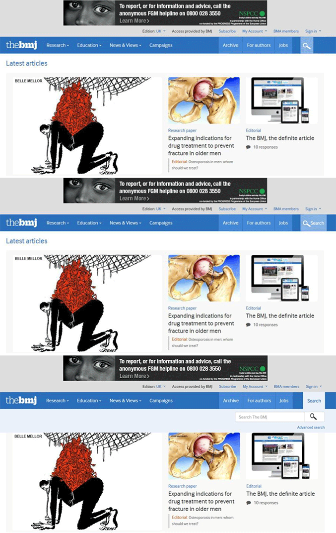
The simple solution below – including a ‘Search’ label for desktop – resolved the search icon use/findability conundrum for the majority of our users. Sometimes, it’s best to take the obvious route! Furthermore, this pattern promotes learnability, as it informs novice users for intended use on other devices.
As gleaned from:
- http://www.nngroup.com/articles/magnifying-glass-icon/
- http://boxesandarrows.com/optimizing-ui-icons-for-faster-recognition/
- http://www.nngroup.com/articles/search-visible-and-simple/
- http://uxmyths.com/post/715009009/myth-icons-enhance-usability


