The Challenge
The aim of the redesign was to improve overall usability and the conversion rates to payment (funnel flow) of the ‘Shopping Bag’ page. The redesign was informed by stakeholder and user research, some competitor analysis and by personal experience.
A launchpad to checkout, this page is a vital driver in pushing users down the conversion path. The focus for the basket page was on serving two user types – novice and returning users. The goal for each was:
- New / novice users: Improve new user UX by reducing barriers to purchase and cultivate trust in the brand and website when handling payments.
- Returning users: Enhance returning user UX by providing a quick passage to the check-out and surfacing and summarising key information which commit users to purchase.
The Process
Research
The general research approach looked something like this:
- Objectives: What are the key knowledge gaps / business and user goals that we need to consider?
- Hypotheses: What do we think we understand about our users?
- Methods: Based on time and resources, what methods should we select
- Conduct: Gather data through the selected methods.
- Synthesize: Fill in the knowledge gaps, prove or disprove our hypotheses, and discover opportunities for our design efforts.
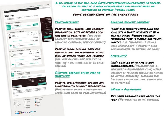
This was a freelance project, and though free to choose my own research methods, I had to work within restrictive time constraints. I began with formative, qualitative research, including desk research to analyse the page in terms of alignment with best practices and conducting Stakeholder Interviews to identify business objectives and elicit everything they thought they knew about their users and competitors.
This research led me to a broad framework of analysis and enabled me to get to the high level issues of the bat:
- How defined and understood are the (business & user) goals for the basket page?
- Do we know what information each user type will require?
- Do we know who are core visitor groups and personas are?
- Can we leverage persuasion techniques such as displaying security messaging and payment options?
- Is there a persistent mini-basket in the site wide header able to show a summary of content?
- Are navigational elements clearly defined?
- Is there clear visual indication to show when an item has been added to the basket?
- Is the content required to answer key user questions readily available?
- Are delivery options and charges explicit and obvious?
- Is the primary CTA ‘Checkout now’ clear, easy to find and use?
- When promoting relevant offers / discounts, are they obvious and easy to redeem?
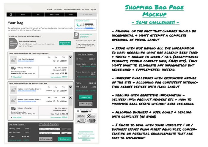
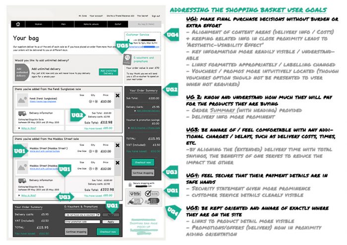
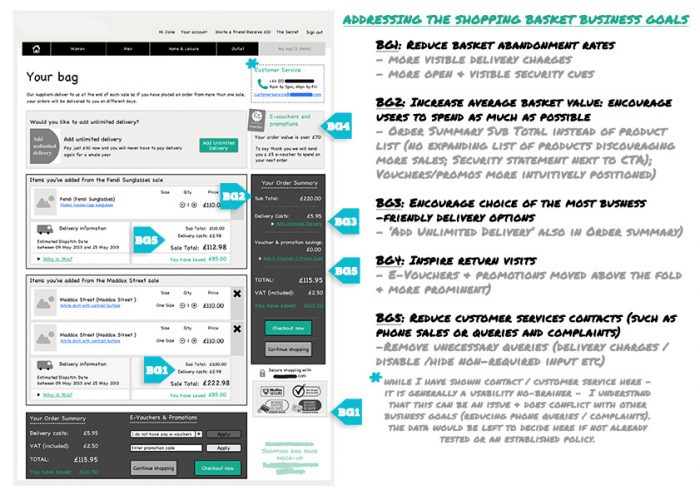
// The challenges; user & business goals; some observations
(Available fullscreen via click) //
I conducted user interviews to help understand the tasks, motivations and pain-points encountered by the particular user groups involved. These were informally structured (guerrilla!) but focussed on the key task under analysis – getting items into the shopping bag and paying for them simply and efficiently. Using think-aloud techniques, some insight was given into usability concerns and user expectations and how we might go about addressing and exceeding them in future iterations of the shopping bag design.
The stakeholder and user interviews enabled us to specify key goals of both the business and the user. Furthermore, the user interviews highlighted specific pain-points encountered while attempting to complete the key task under analysis and this informed key decisions relating to UI design.
Design
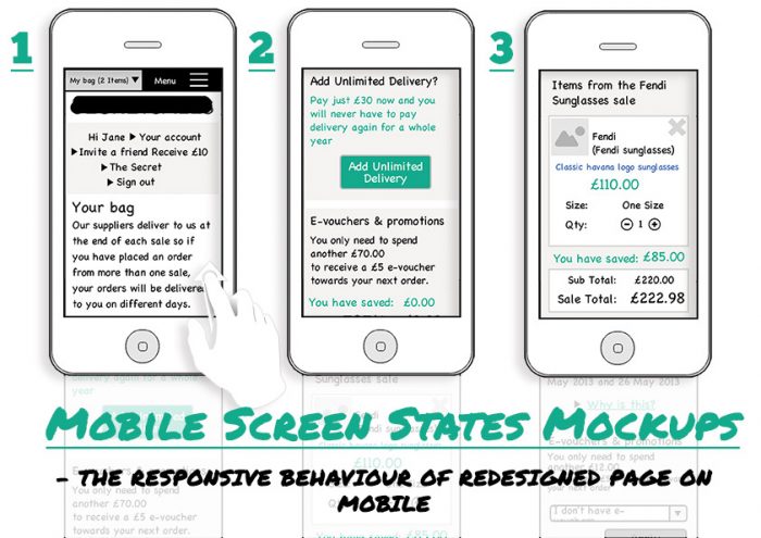
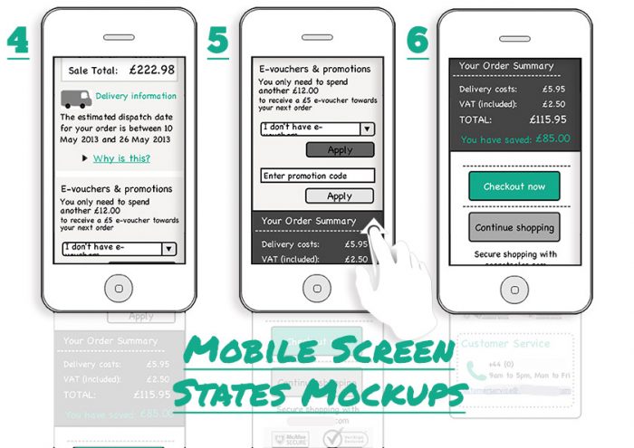
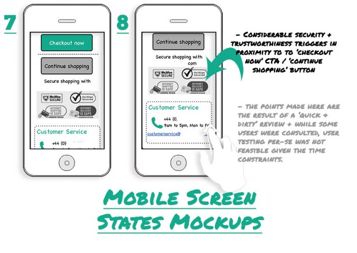
The key deliverables for this project were user journeys and flows and lo and hi-fi wireframes of suggested UI enhancements (some samples of which are shown below).
// Mobile page flows and lo-fi UI design
(Available fullscreen via click) //
The Challenges
There were some issues aligning business and user goals and dealing with such conflicts, as is often the case on such projects. Where such conflicts arose, I took the role of user advocate. Obviously, this cannot always be the case but for this particular project I felt it was the right approach. These included such decisions as providing real-world, live contact information on relevant pages. In testing, lots of users seek out this information (it can foster a sense of security and build loyalty) but it can conflict with the business goal of reducing customer service contacts.
Mindful of the fact that changes would be incremental, a complete overhaul of visual layout was not attempted. Also, not being fully aware of what had already been tried and tested and known to work or not (recommended products; visible contact info; FAQs etc.) was a highlighted concern, not clarified initially in the project brief.
The outcome
The feedback from relevant stakeholders was very positive and many of the suggestions proffered were implemented. The benefits of the approach and the techniques involved provided insights which informed the design of other tasks carried out on the site, too.
Success here – as with other usability projects – will ultimately be determined by improved qualitative feedback as well as quantitative metrics relating to task completion, error rates, efficiency (simplifying the journey) and satisfaction scores. Conversions rates (from drive-by visitors to purchasing users) will be another indicator of success.


Really good portfolio piece. Thanks for sharing.