As a designer – and user-centred design advocate – I admit to reservations about Apple’s ‘genius’ approach to design and their more recent predilection for placing aesthetics above all else. In November, ex-Apple designers and current UI / UX behemoths Don Norman (Apple’s first UX Architect) and Bruce Tognazzini (Apple’s first UI Designer) published a long-read article on FastCoDesign, expressing their views on ‘How Apple Is Giving Design A Bad Name’. As you’d expect, the design community was apoplectic.
While I agree in principle with the authors – it is time question Apple’s position as design leaders and shine a light on their design philosophy – the article is best read as a fantastic piece of design writing. It should be imbibed by anyone interested in what design actually means and how design thinking can give organisations a competitive edge in the fight to deliver innovative products and experiences.
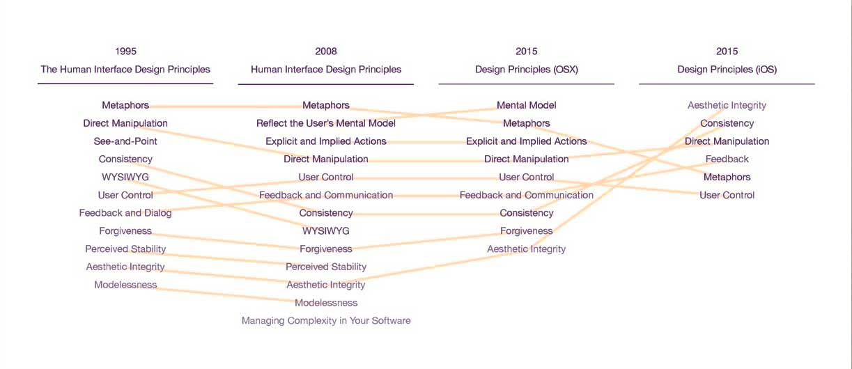
It is a truism that the ‘Aesthetic-Usability Effect’ – whereby aesthetically pleasing designs are perceived to be easier to use – can only get you so far. Norman and Tognazzini argue that Apple have relaxed earlier human interface design principles and claim that five of the most important principles are largely or completely missing from OS X and iOS products. This is a serious charge, rendering Apple products – in their eyes – counterintuitive and difficult to use. Though the products are more beautiful than ever before, they argue that this comes at a very high price.
The authors claim that Apple’s gesture-based products no longer exhibit what were once the pillars of good UI – discoverability, feedback / feedforward, recovery from error, consistency and the promotion of complex use – all demoted or ignored in favour of slick ‘styling’. Apple was once at the forefront of the evidence-based human interface design science. In the eyes of author’s, this is no longer the case.
“Apple is destroying design. Worse, it is revitalizing the old belief that design is only about making things look pretty… Apple is reinforcing the old, discredited idea that the designer’s sole job is to make things beautiful, even at the expense of providing the right functions, aiding understandability, and ensuring ease of use”
Once upon a time, all Apple UI operations were discoverable (via menus), everything could be undone or redone and considerable feedback / feedforward was provided. Users could orient themselves intuitively and nothing (significant) was a surprise or a source of confusion. Serendipitous use was encouraged and users explored more complex features when they felt ready. When Apple moved to gestural input, however, the authors claim they dispensed with many of their founding UI principles. Users were left with obscure gestures, hidden functionality, weak affordances and unreadable fonts – all sacrificed at the altar of ‘visual simplicity’.
The authors provide anecdotal evidence to back up their claims, such as the woman who has to ‘pretend to be disabled’ because she needs to use Apple’s assistive tools to make her ‘uncontrasty’ text readable. Discoverability is another bugbear. Do we know what operations are available to us just by looking at the screen? Swipe? Left or right? 2 fingers or 5? Tap? Single or double? You get the point. Poor affordance is also a highlighted concern – “Is that text on the screen really text or is it a critically important button disguised as text?” These are valid pronouncements, if not, perhaps, unique to Apple products.
When Apple removed the undo button (one of the GUI’s most successful features) users no longer had the ability to recover from certain undesired actions. Gone was the freedom for users to try new things, the ability to discover complex interactions, confident that they could easily undo or find their way back home safely! In the opinion of the author’s, Apple (with iOS) deemed this feature too burdensome for their simple, aesthetic UI and dispensed with it – much to the chagrin of their users. When they did re-introduce undo / redo (after complaints), they did so via the shake gesture. This “essential element of system design” is now hidden behind an undiscoverable, partially implemented gesture. Can I undo? I’ll shake and see… did I shake enough? Or can I not undo this action anyway? A source of confusion? Certainly.
“So often, the user has to try touching everything on the screen just to find out what are actually touchable objects”
Another UI screw-the-user was the removal of the back button, Norman and Tognazzini report. Touch screens offer more than enough rope to hang oneself from the tree of accidental interaction. ‘Oops – not that button!’, ‘Why did I click that link!!?’ These unintended clicks take us to new destinations. Conventionally, the back control serves to re-orientate the user, aiding quick recovery from interaction errors. Apple, they say, has decided that visual simplicity is more important than ease of use and while a back button exists in specific locations, it’s not universal (unlike Android).
The authors do admit that the ‘looks great / confusing to use’ paradigm is not unique to Apple. Google Maps, the Android OS and Window 8 all look swell but have points of confusion, too, they point out.
(more to follow)


