The Challenge:
Nailing the search and search results page is crucial for most digital products. When that product is a clinical decision support (CDS) tool, the stakes are significantly raised.
Here, intuitive use and efficient and error-free task completion are clear usability goals. Equally important is the provision of accurate and relevant results, the timeliness and freshness of these results and their stability over time.
“Search is a conversation: a dialogue between user and system that can be every bit as rich as human conversation.”
UX Mag
UPDATE: The BMJ Best Practice site subsequently won a number of User Experience Awards and honours, for …” demonstrating a standard of excellence for user experience, with innovative design and user-centred functionality”.
Some Background:
Over a 12 month period, the BMJ undertook a rebuild of their flagship clinical decision support (CDS) tool – BMJ Best Practice. Defining and designing a new user interface to replace a tired, cluttered one that had reached it’s local maxima was the broad objective.
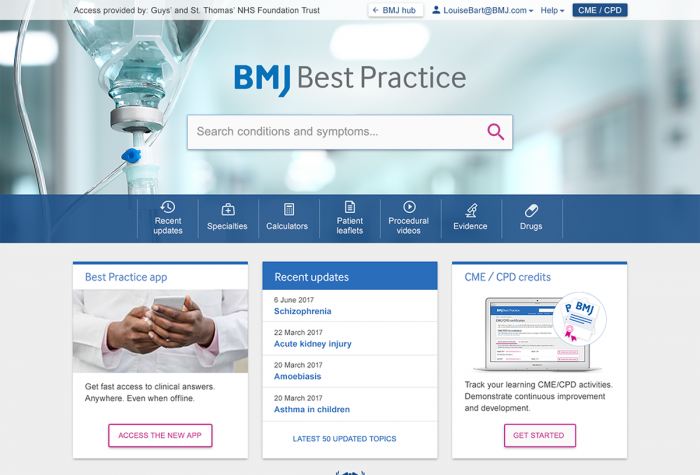
This necessitated making key enhancements to the search functionality (outlined in this post), enriching the landing page, upgrading the navigation and IA, and introducing new site features.
I worked as part of a high-functioning and highly-collaborative Agile Scrum Team, consisting of five backend developers, one frontend developer/designer (yours truly) plus another FED contractor (who arrived half way through), a QA, and of course the Product Owner.
Our users:
Our users (primarily doctors and other medical professionals) are time-poor, busy and possibly stressed. They require efficient and intuitive access to relevant content and features. Previously, however, they were presented with unnecessary options and confusing journeys, a key driver for our redesign.
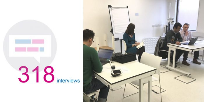
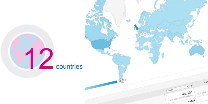
// A considerable amount user research was undertaken – both in the UK and abroad //
Main objectives:
User Objective: Testing suggested that too many search results were presented to users, delaying task completion, increasing the likelihood of selection errors and contributing significantly to cognitive overload. Additionally, users didn’t see a need for the informational features that surrounded our search results – a key feature of our search UX – and instead found the results page ‘a bit cluttered’.
Business objective: The business wanted a UI intuitive and flexible enough to showcase our rich and varied content – content which is evidence-based, relevant, accurate, up-to-date and fit-for-purpose. The insights provided through our UI should directly improve patient care and outcomes.
My Role:
I was a member of the scrum team for the full project, frequently switching roles from UX design to frontend development (between Product and Engineering) depending on project phase, UX design requirements, or the feature we were building / redesigning.
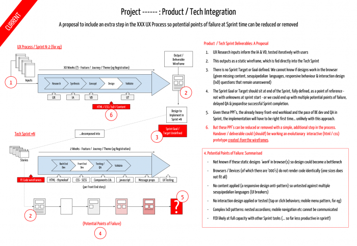
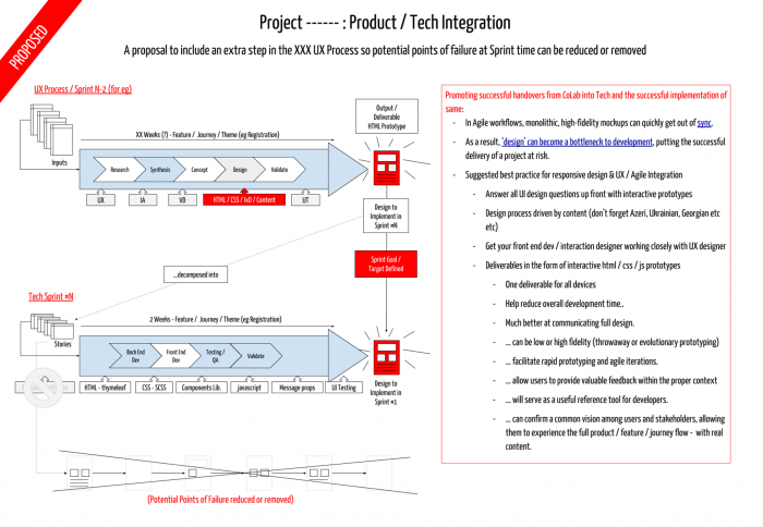
// A Product Development process change, as presented to key stakeholders.
This was adopted and resulted in a dramatic increase in Sprint productivity
(Available fullscreen via click) //
Acting as a conduit, of sorts, between Product and Engineering teams, I evaluated the technical feasibility of design concepts before they went into a sprint or in front of our users.
The frontend was built on a custom Bootstrap 4 / Material Design Framework (which I developed and themed myself), sitting on a new Java (Spring Boot / Gradle) backend.
As well as my work on the Front End Framework, I also developed a UI Components Library (Phase 2 will React-ify these). This led to a significant increase in sprint productivity, fostered good UI/UX design and allowed for rapid iterative development of an evolutionary prototype, which we used to gather user data – and keep our stakeholders happy!
UX/UI Design & Research:
Approach:
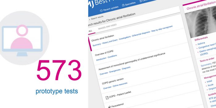
The project demanded extensive user testing (see above), determined as we were that the project would be customer and user driven. Ideation workshops delivered early design concepts and user flows. From these outputs, we built low-fi prototypes which were used in face-to-face and remote user testing to drive our generative research.
Ethnographic studies and user / stakeholder interviews were also conducted, giving us qualitative insights into our users behaviours and motivations, attitudes and experiences – all of which helped shape the direction of our early designs.
As our nascent UI matured, we conducted more summative, quantitative testing on developed features and user journeys. This primarily involved more task-based user testing, but also other evaluative activities such as heuristic analyses, giving us some valuable data which we could lean on when getting stakeholder buy-in or faced with tough design decisions.
Key Deliverables:
- We conducted rounds of formative research with our different user types, exploring how we might improve search usability and overall user experience.
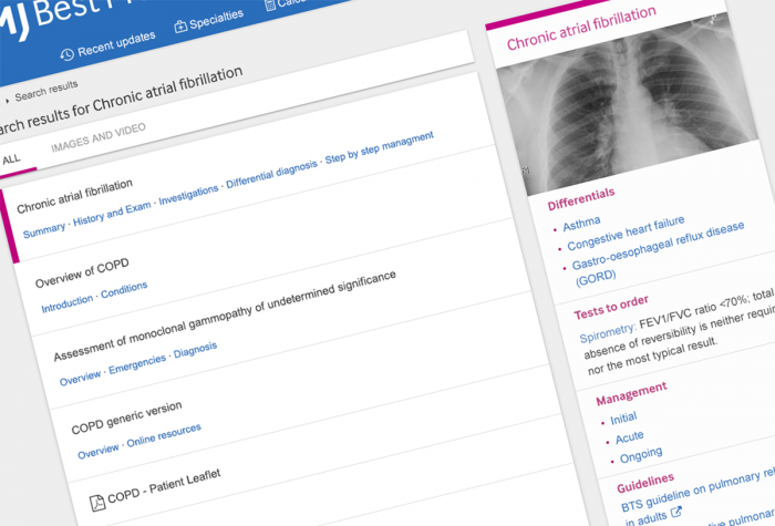
- The output of this was a more streamlined SRP UI, with much of the surrounding informational features removed. The number of results presented to the user was also reduced.
- We kept the number of results per page to a maximum of 15 with a ‘show more’ button easily accessible. (According to a 2014 study from Advanced Web Rankings, more than 67% of all clicks on SERPs go to the top five listings (see point 4) though we needed to balance this with our business objectives)
- We also reinforced the results hierarchy by including deep dive links into the relevant content for the first 5 results. This intuitively suggests to the user that we are confident they will find what they were looking for in those initial results.
- As an internal investigation, we also conducted a search-specific Heuristic Analysis of our old and newly designed search results UI for comparison and benchmarking. (You can download the checklist here if you wish).
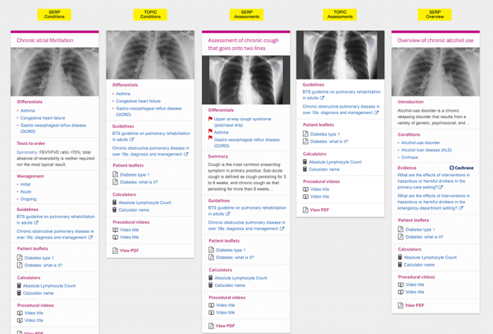
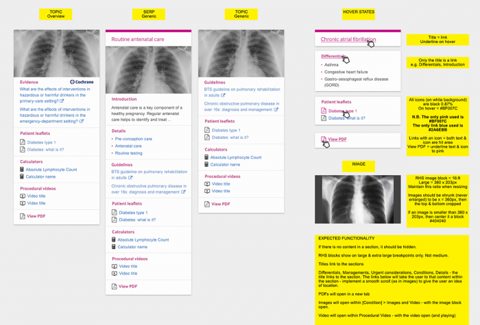
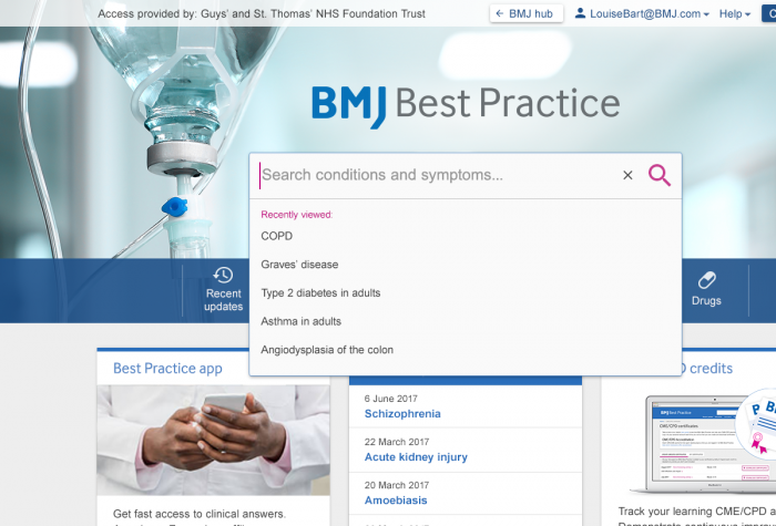
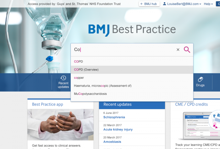
// Some hi-res visuals on route to our final UI Design //
Some thoughts:
We confirmed that users were not interested in serendipitous use when in work mode. They wanted to make a rapid decision based on the search results relevancy – and were willing to trust us to direct them towards the correct result. Specifically, they did not want to experience indecision or ‘cognitive drift’, which can happen when presented with varied and multitudinous results.
Concepts such as ‘Information Foraging’ & ‘Information Scent’ helped guide our thinking and offered valuable insights into how we went about our UX research, design and thinking.
Information Foraging Theory (Pirolli and Card, 1999) is one of the most important concepts to emerge from Human-Computer Interaction research. It is used to predict what users will do before they navigate a website and explains how users interact with systems when seeking information.
Information Scent – a key part of Information Foraging Theory – uses the analogy of an animal hunting for prey. It relates to the strength of relevant messaging throughout the user journey, as well as visual and textual cues, that provide informavores with the motivation to go on to finish their search task – or abandon it altogether. Through this, users estimate a given search’s likely success (the reduction of the information space) from how strong it’s ‘information scent’ is.
This unearthed an interesting conundrum. Our users found the SRP cluttered, yet this perceived clutter was valuable informational features (number of results, hyperlinked content, content snippets etc) which provided strong ‘information scent’ and necessary control features (faceted search; advanced search options etc). Removing these might be throwing baby out with the bathwater! As we know, good search results should have accompanying information that helps the user make a informed decision.
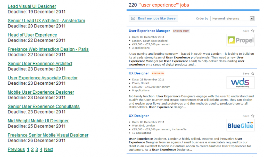
An alternative solution (above left) would result in a list of similar looking, non-differentiated results, devoid of any defining information and offering very weak information scent. This pattern will inevitably result in pogo-sticking, as users jump back and forth from the results page to content page, undermining the user experience and damaging usability metrics. This behavior is indicative of people struggling to find relevant content.
Results / Impact:
Despite reservations that perhaps too many informational features were removed – meaning users might feel like they’re fumbling around in a darkened room – we launched our search results page to good qualitative feedback and users report improved time to task completion and improved overall user experience.
I have my suspicions that we’ll see pogo-sticking in our analytics but as yet we don’t have sufficient data to analyse any impact. I’ll update here once we do.


